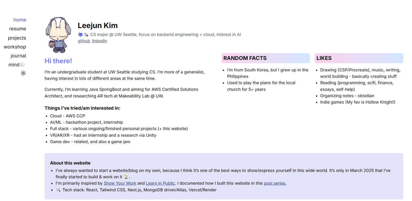
My close friends/family might know that my website used to look like this:

I mean, my first motivation was to make it look like one of those pinterest cards with cute icons and stickers. I liked this design at first, but as time passed I started to not like it as much as before.. I especially wanted to change the general color scheme too, to a more blueish color, and rearrange the layout.
So here were my main reasons:
- I didn't like my design anymore lol, I wanted a cleaner, prettier aesthetic but also minimal at the same time?
- My codebase was a HUGE mess. I had lots of copy and paste from old stack overflow forums and pages, and they were heavily unorganized. For example my CSS file had so many unused code snippets with various imports that were ~100 lines long, and they weren't even necessary.
- I wanted to add more interactivity into the blog posts, which, with the Tiptap-based CMS, was limited.
Using Mdx
First of all, I really wanted to add interactive portions to my blog posts. One of my biggest inspirations for this is using p5.js and VPython, which I would love to embed visual things directly.
So I decided to not use MongoDB for storing blog posts but instead use MDX directly in my repo and save them there. This also meant saying good-byt to the CMS I built (which I don't particularly regret because it gave me very good practice).
The layout & style
I moved the categories up and made it horizontal. I had initially made it vertical because I thought I will expand my website with more categories, hence moving down would look better than moving sideways. But now I changed my mind and wanted a more minimal design with less clutter.
I also was considering a separate about page, but I didn't really know
what to put in there that weren't already on the home page, so I just combined
them.
For the blog section, I also gave up on the idea of a complex blog category system, because I thought I would rather focus on other projects and writing.
- I was largely inspired by Eli Bendersky's web-blog and decided to keep everything minimal. Future plans would include categorizing by year, category, and top/recent posts (for now).
As for the design, I really wanted to go for the old Windows-98 aesthetics. While looking for fonts, I had considered many similar ones, but I discovered that the MS W98 UI font was free to use, so I got it.
And the past design just doesn't quite feel right, I don't really know how to explain it. It felt a bit flow due to the fetching from the DB, the colors were too white and black (aside from the pastel), and the layout felt largely clunky.
Now I'm largely satisfied with the Windows aesthetics and the blue theme, although I would like to add more widgets here and there. For example, I'm planning to get stats from Google analytics (like how many visitors total) and display the info as a cute little widget somewhere.
I also want to add some interactive portions and integrate more art, and maybe a guestbook section.
Overall
I'm pretty satisfied with the outcome, although I still have many features to add. (This post will probably continue to update)